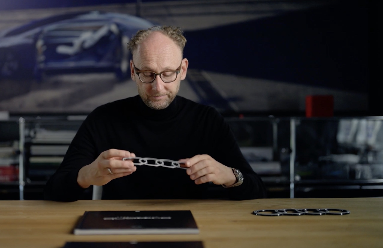
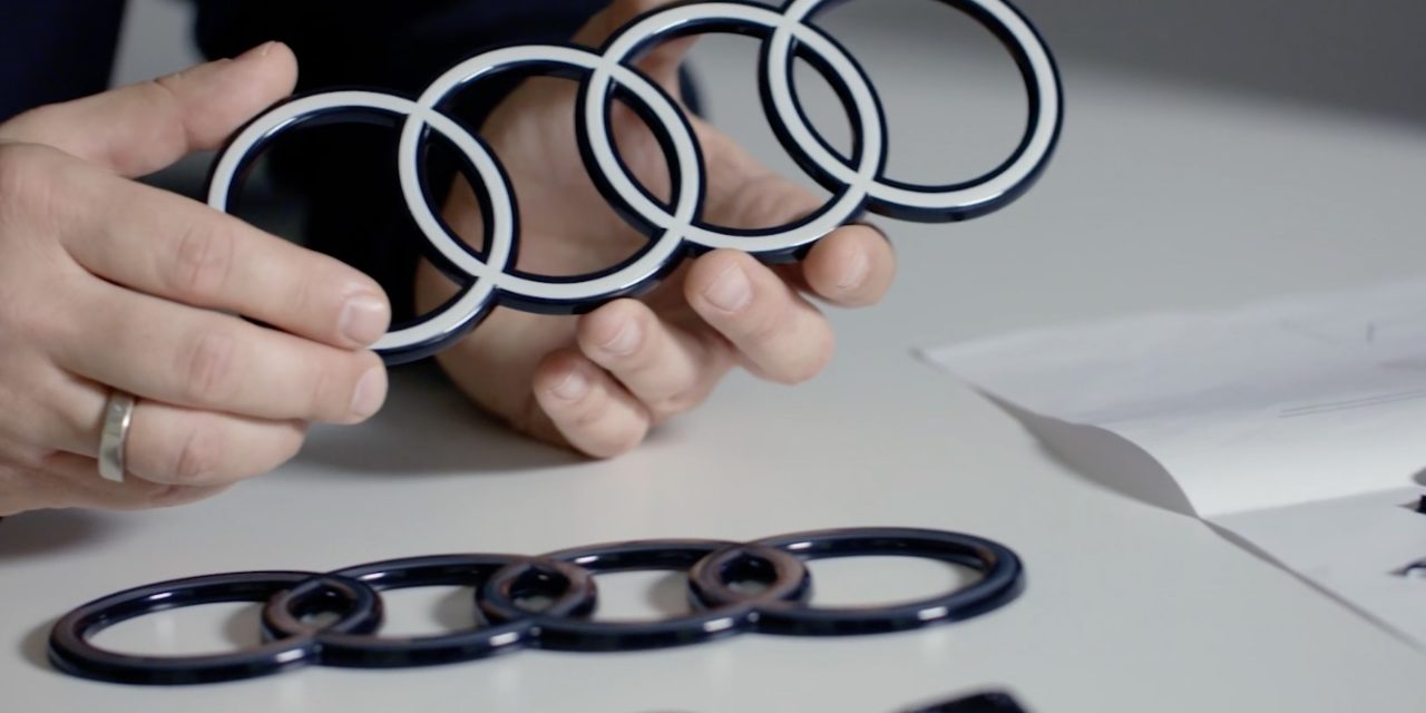
We feel compelled to talk about the new Audi logo/emblem because every other automotive news outlet is talking about it. But let’s go out on a limb here & say… who cares. The new Audi logo looks the same as the old Audi logo: 4 circles. It’s the same logo.
“More purity, more reduction, more consistency.” says Audi. Ok but…
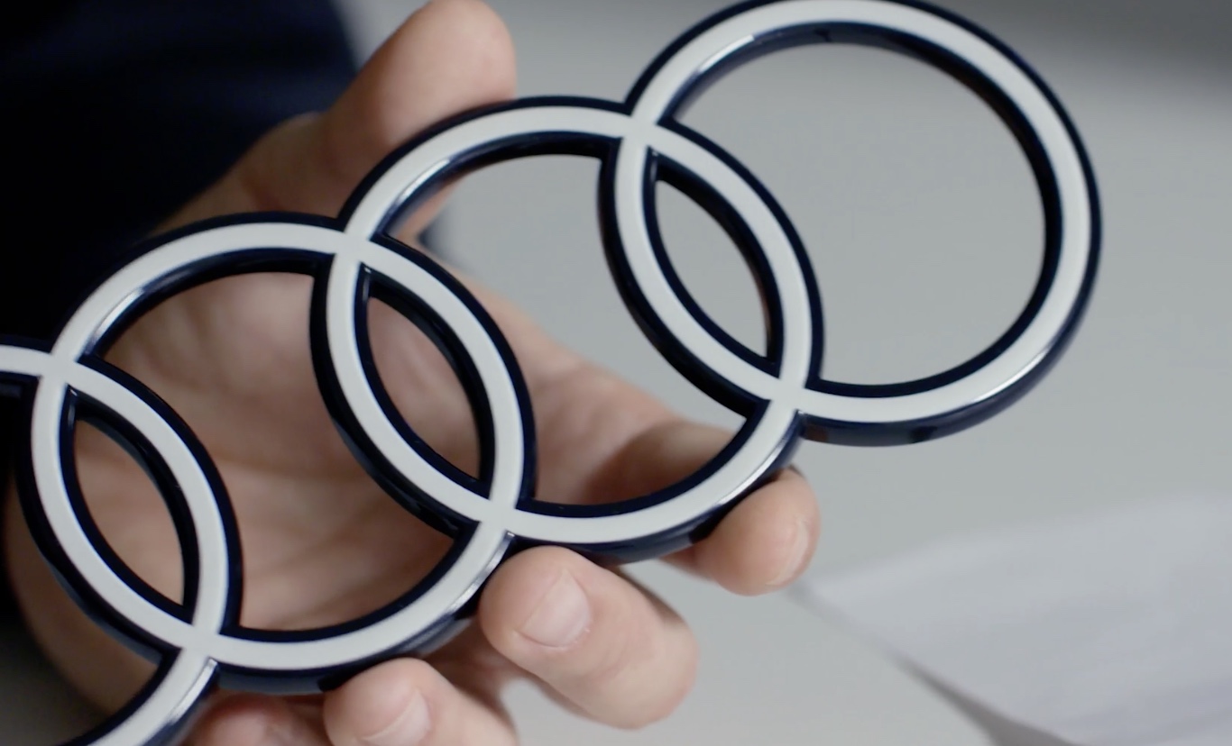
It’s the same damn 4 circles.
The only notable difference is, instead of being slightly raised & bevelled like it was… now it’s just flat & white. As if Apple made it. Some Audi enthusiasts are not happy, saying the new logo looks cheap. To that I say, have no fear, I’m sure it won’t be.
